Tuesday, March 24, 2009

Animated Type

Animated type is type that moves.

However, creating animated type is not as easy as you think. With computer and advanced technology, it's pretty easy to make simple animated type with just a click of the button, but since it's only a click away, anyone can make animated type; which means that you'd have to be extra creative to make some interesting animation. Think of Saul Bass's movie titles; he did them back starting from the 50s till the mid 90s! It's really amazing what he did.

I was in awe when watching the samples on Adobe.com and movie titles on YouTube. I didn't know how they were made before and now, I'm sure I can do it too! (not as good, of course) I also thought for a while that I should do this instead of graphic design... Anyhow, I'm sure I'll learn more about it even after this project is over.

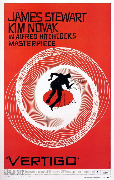
Saul Bass' movie titles are pretty amazing (as I mentioned above). It doesn't really matter if there is sound or not because I got the eerie feeling without the sound. I watched them again with sound and... Ah! Cape Fear is just too freaky! I don't like the movie sequence on Cape Fear (too scary) and I like Vertigo and Anatomy of a Murder's title sequences.

Vertigo's poster has the circular graphic that's repeated on the tile, but I never knew it was suppose to be an eye. At the beginning it was the close-up of a woman's face, and when it focused on her eye, the spinning graphic started emerging from her eye... It was an "Ah Ha" moment for me, "it's a spinning eye."
Anatomy of a Murder looks comical (because of it's ragged paper-cut body parts) and with the sound (almost jazzy music in the background) just enhanced the comedy. I'm not so sure if it's a comedy, but from what I read on the Internet it could be. I liked it especially when at first the arm appeared on the screen and it was sliced in 3 parts, and when the head came out I fear that it was going to be sliced too, and sure enough it did.

Saul Bass created a suspense enough without any sound. His graphic choices are really fitting and the sequences really provides a short intro of the movie and what the audiences can expect from the movie. Thank goodness for Bass!

Another cool title sequence that I really, really, really, really like is Bass' "It's a mad, mad, mad, mad world." Just so fun!


Oh, I forgot to mention this: I really like Bass' fonts on his posters. They're almost always his original hand letterings and it's awesome!

Cult of the Ugly

The Cult of the Ugly was written by Steven Heller in 1993 criticizing the designs today are UGLY. In his words, the examples I'm showing are what he would have, no doubt, called ugly. But who defines ugly and beauty? The audience/viewer, so it's really up to you (anyone and everyone) to say if they're ugly.

The Post Modern examples are really great inspirational pieces. These are a couple of my favorites and the lest favorite one.

This one by Ed Fella and P. Scott Makela is so simple and disturbing yet drives the message so effectively.


This, of course, is by David Carson. I think this is almost his signature layout.
I tried to do his type treatment the other day, but it's just not the same.


This poster, designed by Stephan Sagmeister, is my least favorite of all. I'm just so disgusted by the two tongues that are sticking out. I know they are replacing the arms of 'F' and 'E', but I just hate it. However, if not the tongues, I love the poster—I love the handletterings, the 'F' and 'E' bracketing the title, and I love that it's messy but organized too. He's one of my favorite designers, but I hate his two tongues.


Reading the very, very long interview with Steven Heller, one of Emigre's essays, I realized that Heller seemed to contradict himself many times. Or perhaps his reasonings are not very clearly laid out, like on a map, so everything repeatedly goes forward and backwards. It takes some time to understand some of his reasons, but nonetheless, the interview was good. I'm glad I got to read it.
(He seemed to really dislike the designers from Cranbrook.)


From Katherine McCoy's essay, 'Rethinking Modernism, Revising Functionalism':

"[The Swiss International style] approach was fairly foreign to American clients and in 1968 it was remarkably difficult to convince corporate clients that a grid-ordered page with only two weights of Helvetica was appropriate to their needs. Now, of course, one can hardly persuade them to let give up their hold on "Swiss", so completely has the corporate world embraced rationalist Modernism in graphic design.

So once upon a time American corporations didn't like the Swiss style, how about that. Perhaps they even thought it was too plain, too simple, too ugly... My point is, what seems ugly now might be the normal standard of style/design later. Like McCoy pointed out, and we see it everyday still, it's hard to break from the style today.


Like Heller says, "Ask a toad what is beauty... He will answer that it is a female with two great round eyes coming out of her little head, a large flat mouth, a yellow belly and a brown back." What you see is ugly might seem beautiful to someone else, think of all the culture today and how different they are from each other.

We should embrace the ugly designs, and we should especially learn from them. Just like Segmeister's tongues, someone else might love them. I learned from it, and who knows, someday I just might do something like that.

Tuesday, February 24, 2009

Importance of Writing for Designers

Why is important for designers to write well?

I asked myself many times before when I need to write an essay, “WHY?” and complain “I don’t want to write!” Mind you, I still do, but I also learned to accept the fact that writing is important, even for designers.

There seem to be three ways to communicate: visually, verbally, and literally. For designers, we deal with the visual communication most often, so obviously that’s important. Many of us speak, but speaking well is different from just talking normally. At some point in our careers we will need to give a presentation, so verbal communication needs to be developed well, but that’s another subject. The topic of this blog entry is writing.

Designers can’t always visually communicate successfully with their target audiences, so to ensure they get it, we’ll need to write it out. The writing needs to be clear and understandable and it needs to be thoughtfully written, otherwise we’d lose our audience. There are copywriters for some jobs, but not always, and when we’re dealing with words all the time, it is especially important for us to know how to work with them.

Another major importance we designers need to write well—our resumes and cover letters. It’s hard to be employed (long-term or just freelance) if we can’t even write simple things well.

I find that reading improves writing skills, and the more I read (and write), the better I write, and the better I can write, the better my designs are. Writing is a creative process, so if we (designers) can write logically, we can also design sensibly.

Though I approve of bettering our writing, I absolutely reject the idea of writing when pressured to finish in a short deadline. The creative design writing course mentioned by Andrea Marks in “The Role of Writing in a Design Curriculum” is different because it is a semester-long class where the only objective is to write better; there are deadlines, but it is much easier to learn and improve when the focus is just writing, not writing and designing both at the same time.

Just my opinion. I know it doesn’t change the fact that I still have to do my research paper for my design classes, so the least I can do is whine about it...

There is much to gain and nothing to lose if you can write.
Read lots, write whenever, and design often! It only gets better.

Other reading sources:
“Better Writing Through Design”
Brand New. Very cool site!

Tuesday, February 17, 2009

Design Observer

There are too many articles to read on Design Observer, so, instead of picking through any two, I went with what Rachel recommended.

I really like them all—funny and so creative! I particularly liked Stephen Doyle's work; he really is “ a graphic wordsmith!” (from Stephen Doyle: A Few Words). He is such a genius: WAS masked out on a SAW!; cut out “crafts and arts;” “enemy” with its “new” shadow; his “think!” dice... How does he come up with so many cool ideas for type? Seeing his type art inspires me to do something fun too. As William Drenttel mentioned in that article, Doyle doesn't just Photoshop to make the type; he actually blotted two book together; folded paper to make the word “paper,” and bent a book! I think one of the reasons he's so good is because he doesn't just Photoshop everything. Part of the fun is to actually make stuff, and if it's you’re job, might as well have some fun out of it.


Too cool!

In Jessica Helfand’s “Type Means Never Having To Say Sorry,” a senior graphic design student used the Futura typeface on her Sigmund Freud’s book jackets. Since I’m taking Design History right now, I have some idea of the time period the font and book was created, but if I wasn't taking the history class, I would have no idea and probably answered “I don't know” like the senior. Not that the typeface is inappropriate for the subject, but it is important to know the history/background of something you’re designing, and to have a good reason to why you chose something than just “because I like it and it’s cool.”
I hope when I graduate I’ll have better answers than that senior.
The Futura typeface is overused, like Helvetica, it is now seen everywhere. It is a beautiful and modern sans-serif, and the fact that it was designed in 1928 is just amazing! However, it is so overused, the things created just seem so oridinary and unoriginal—like Barbara Kruger’s graphical style of using Futura.


Barbara Kruger’s style—black & white background image, bold red block, and knocked out Futura—is so simple! I am pretty sure I’ve done this many times without the acknowledgement of the style and the fact that Kruger existed. Michael Bierut’s “Design Under the Influence” mentions the reasons graphic designers today design what they design. And I have to agree completely with him.

“Kruger’s work, after have been so well established for so many years, has simply become part of the atmosphere, inhaled by legions of artists, typographers, and design students everywhere, and exhaled, occasionally, as a piece of work that looks something like something Barbara Kruger would do.”

Can one artist/designer own a style? I don’t think so, and neither does Bierut.

Another article, also by Bierut, “Thirteen Ways of Looking at a Typeface,” is funny and informational. I had no idea a person could be (quoting Bierut) “typographically promiscous.” To use 37 typefaces across 16 pages is a bit too excessive, but if he can make his book work with 79 (yes, seventy-nine) typefaces, each chapter with its own typeface, and not be a bit messy at all, then I guess it’s a great thing. Maybe...

I think it’s still too many. I don’t even think Satan (see below) woule approve it.

Monday, February 9, 2009

Stefan Sagmeister

Only when I was looking through his website did I realize he/his studio designed the "World Changing" book I listed below as one of my favorite book covers. His other work are also creative, original, and truly inspiring.

Watching and reading his design philosophy/ethics made me happy! As he mentioned in his lecture on "Design can make you happy," designing something ordinary but out of context (like the instruction panels in the subway cars) is just genius! He really had the guts to do it.
Using his own inspirational emotional feeling to use in his design is great too. Very original. I should follow him and write up a list of things I learned.
His use of typography is fun! I especially liked it when he showed "for" in cut up sausage-links, but using the shadow to form the words. The bubble speech sticker of the Korean designer is great! Easy way to engage interaction.

A good design helps a good cause; good design with bad cause/meaning is NOT good. In his article on Typotheque, he discusses the meaning of "How good is good?" It's, again inspiring (I'm sorry for overusing this word, but it really is...). After reading his article, it made me want to be a good designer who does good stuff for a good cause. Not just on a persoanl satisfaction, but doing something good for others. If I could be just like 1/10 of him, I'll be happy.

Here's the list of things design can do:
- Design can unify.
- Design can help us remember.
- Design can simplify our lives.
- Design can make someone feel better.
- Design can make the world a safer place.
- Design can help people rally behind a good cause.
- Design can inform and teach.
- Design can raise money.
- Design can make us more tolerant.

I have to disagree with him on one matter—Hong Kong is not a horrible place. Sagmeister made the place sound so bad. It is certainly different from the United States, but if he lives in New York, Hong Kong has the same feel to it too! Growing up in Hong Kong, I get to see the beauty that most tourist don't in one trip. It is a place that takes some time to get used to. And from a design viewpoint, Hong Kong is full of great design. With so much visual interaction, there's bound to be something good.
I miss Hong Kong... Maybe I'll go back this summer.

10 Commandments of Typography

The rules of abiding & breaking the 10 Commandments of Typography

The 10 Commandments
(list is from Paul Felton's book)

1. Thou shalt not apply more than three typefaces in a document.
2. Thou shalt lay headlines large and at the top of a page.
3. Thou shalt employ no other type size than 8pt to 10pt for body copy.
4. Remember that a typeface that is not legible is not truly a typeface.
5. Honor thy kerning, so that white space becomes visually equalized between characters.
6. Thou shalt lay stress discreetly upon elements within text.
7. Thou shalt not use only capitals when setting vast body copy.
8. Thou shalt always align letters and words on a baseline.
9. Thou shalt use flush-left, ragged-right type alignment.
10. Thou shalt not make lines too short or too long.

So, if everyone follows these rules, everyone can be a good page-layout designer. Anyone can do it, so designers won't be needed. Instead, they'd be called lazy and boring people.
If this is true, why the evil-underground-place am I taking this second type class and expecting to take more later...
If there is God, there is always a Demon.

Here are the Type Heresy
(list also from Paul Felton's book... he must have both the angel and demon on his shoulders.)

1. Break the fetters imposed by the use of only three typefaces.
2. Let thine eyes be seduced by the hierarchy of type.
3. Do not forsake smaller or bigger sizes.
4. Be seduced into trying new and expressive typefaces.
5. Treat kerning and tracking with total irreverence.
6. Entice the reader to sample the delights of your text.
7. Do not forgo the liberal use of capitals within your text.
8. The Lord designed letterforms to stand side by side, but there is no harm in their being lured away from one another.
9. Yield to the temptation to align text in unusual ways.
10. Lure the reader down unfamiliar paths.


* Remember, one of the rules of rules is to break the rules—follow the rule.

Tuesday, February 3, 2009

Jakob Trollback

His motion works are just too cool!
Amazing!
I definitely learned a lot from him.


Links to videos and articles:
SVA: Guest Lecture - Jakob Trollback
Trollback - CBS redesign
Trollback + Company