

Animated type is type that moves.
However, creating animated type is not as easy as you think. With computer and advanced technology, it's pretty easy to make simple animated type with just a click of the button, but since it's only a click away, anyone can make animated type; which means that you'd have to be extra creative to make some interesting animation. Think of Saul Bass's movie titles; he did them back starting from the 50s till the mid 90s! It's really amazing what he did.
I was in awe when watching the samples on Adobe.com and movie titles on YouTube. I didn't know how they were made before and now, I'm sure I can do it too! (not as good, of course) I also thought for a while that I should do this instead of graphic design... Anyhow, I'm sure I'll learn more about it even after this project is over.
Saul Bass' movie titles are pretty amazing (as I mentioned above). It doesn't really matter if there is sound or not because I got the eerie feeling without the sound. I watched them again with sound and... Ah! Cape Fear is just too freaky! I don't like the movie sequence on Cape Fear (too scary) and I like Vertigo and Anatomy of a Murder's title sequences.

Vertigo's poster has the circular graphic that's repeated on the tile, but I never knew it was suppose to be an eye. At the beginning it was the close-up of a woman's face, and when it focused on her eye, the spinning graphic started emerging from her eye... It was an "Ah Ha" moment for me, "it's a spinning eye."
Anatomy of a Murder looks comical (because of it's ragged paper-cut body parts) and with the sound (almost jazzy music in the background) just enhanced the comedy. I'm not so sure if it's a comedy, but from what I read on the Internet it could be. I liked it especially when at first the arm appeared on the screen and it was sliced in 3 parts, and when the head came out I fear that it was going to be sliced too, and sure enough it did.
Saul Bass created a suspense enough without any sound. His graphic choices are really fitting and the sequences really provides a short intro of the movie and what the audiences can expect from the movie. Thank goodness for Bass!
Another cool title sequence that I really, really, really, really like is Bass' "It's a mad, mad, mad, mad world." Just so fun!
Oh, I forgot to mention this: I really like Bass' fonts on his posters. They're almost always his original hand letterings and it's awesome!
However, creating animated type is not as easy as you think. With computer and advanced technology, it's pretty easy to make simple animated type with just a click of the button, but since it's only a click away, anyone can make animated type; which means that you'd have to be extra creative to make some interesting animation. Think of Saul Bass's movie titles; he did them back starting from the 50s till the mid 90s! It's really amazing what he did.
I was in awe when watching the samples on Adobe.com and movie titles on YouTube. I didn't know how they were made before and now, I'm sure I can do it too! (not as good, of course) I also thought for a while that I should do this instead of graphic design... Anyhow, I'm sure I'll learn more about it even after this project is over.
Saul Bass' movie titles are pretty amazing (as I mentioned above). It doesn't really matter if there is sound or not because I got the eerie feeling without the sound. I watched them again with sound and... Ah! Cape Fear is just too freaky! I don't like the movie sequence on Cape Fear (too scary) and I like Vertigo and Anatomy of a Murder's title sequences.
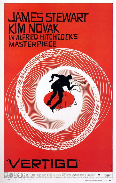
Vertigo's poster has the circular graphic that's repeated on the tile, but I never knew it was suppose to be an eye. At the beginning it was the close-up of a woman's face, and when it focused on her eye, the spinning graphic started emerging from her eye... It was an "Ah Ha" moment for me, "it's a spinning eye."
Anatomy of a Murder looks comical (because of it's ragged paper-cut body parts) and with the sound (almost jazzy music in the background) just enhanced the comedy. I'm not so sure if it's a comedy, but from what I read on the Internet it could be. I liked it especially when at first the arm appeared on the screen and it was sliced in 3 parts, and when the head came out I fear that it was going to be sliced too, and sure enough it did.
Saul Bass created a suspense enough without any sound. His graphic choices are really fitting and the sequences really provides a short intro of the movie and what the audiences can expect from the movie. Thank goodness for Bass!
Another cool title sequence that I really, really, really, really like is Bass' "It's a mad, mad, mad, mad world." Just so fun!
Oh, I forgot to mention this: I really like Bass' fonts on his posters. They're almost always his original hand letterings and it's awesome!
No comments:
Post a Comment