Tuesday, March 31, 2009

John Maeda


Wow. He is a pretty cool and smart person!

John Maeda is currently the president of the renowned RISD (Rhode Island School of Design), appointed to that position just last year in 2008. Maeda was also the Associate Professor of Media Arts and Science at MIT (Massachusetts Institute of Technology).

As a computer science student at MIT, Maeda was torn between his passions for both computer science and arts. One day, his instructor Muriel Cooper persuaded Maeda to follow his arts & design dream. And good thing she did because Maeda is truly a great designer and his teachings/thoughts really change one person's point of view on design.

He went on and got both his BS and MS degrees from MIT and PhD in Design at Tsukuba University Institute of Art and Design in Japan. He's written books on computer media designs and his most recent book was The Laws of Simplicity.

The Laws of Simplicity outlines 10 rules of simplicity. Some are contradicting the other rules, so what really are the laws? Or is there even one definite rule to simplicity? If Maeda can't even be sure of it, then I doubt I can. However, his 10 rules are pretty good "guidelines" to want to make simple things/designs.
If I have to live by one of his rules, it would be "Simplicity and complexity need each other." This statement really says it all—the whole simplicity business is not really simple and nothing can live without it's opposite. So in a design, it needs to have both simple and complex information.

Perhaps to make a good design it need to achieve a balance in simplicity and complexity, or maybe not, because that might be too harmonious and prove to be too boring...
Then again, one person might see one thing in simple whereas another sees it very complicated.

I don't know what to say now. My thoughts are both simple and yet too complicated to even describe them in words... Anyhow, Maeda is a very important contributor in the 21 c. He didn't get those honorary awards for nothing, you know.

He's pretty funny too, which makes him even more interesting. Here's a speech he gave for a TED conference and I enjoyed it immensely.

Sunday, March 29, 2009

Pretty Cool Type Animation

Title sequence from Jeff Schaffer's 2004 film "Eurotrip." The title sequence is designed by http://www.prologuefilms.com. Video by MovieTitleSequence on YouTube.

Thursday, March 26, 2009

Great Speech Type Animation


I'm doing the "First promotional message recorded on an Edison Phonograph" by Len Spencer.

The speech is important because it was the first promotional message recorded on a phonograph, therefore giving something new, fresh, and interesting for the audience. I can just imagine regular people listening on the radio in 1906 and see their exciting faces! Anyway, it was an important step in history and that's why it's important and interesting.

Len Spencer has a pretty good voice. The speech is a little blurred, not very crisp like our digital recordings today, but hey, it was recorded in 1906 on the Edison phonograph, give it some credit. Spencer's tone throughout the whole speech is dreamy and also exciting. He used a first-person narration—"I" was the Edison phonograph—so it was more interesting. He was promoting something new, and since it was an advertisement, he emphasized a lot on what "I" can do. That's why I think it has a dreamy quality... like having the phonograph can solve all your problems. "I can love...", "I can give...", I can aid..." and I had to giggle when I heard "I give pleasure to all, young and old." I thought, "Wow! I wish I can have a phonograph."

After listening the speech, it made me want to buy a phonograph, so it can solve all my problems... and do all my homeworks...


Short bio on Len Spencer

Born in Washington D.C. on January 12, 1867, Len Spencer became one of the earliest stars of recorded music. He was a rising star on the vaudeville circuit when Thomas Edison created his wax cylinders as a way to capture sound. Originally conceived as a helpful dictation tool, Edison and others soon realized the broader applications to the cylinder, most notably in the realm of entertainment.

Spencer was hired by Edison to help promote his retooled invention, and created the first recorded promotional advertisement in 1888 for the "genuine Edison phonograph." Spencer recorded hundreds of songs on cylinders for Edison and Columbia (the Washington-based recording company that evolved over time into the huge Columbia Records company, now part of the Sony conglomerate), including "Little Liza Loves You" in 1891, one of the best selling cylinders of all time.

He was also one the first white performers to record with an African-American artist, George Johnson. Johnson had an enormous hit wax cylinder in the mid-1890s with his number, "The Laughing Song," which—because of the inability to mass produce wax cylinders—forced him to sing the song several thousand times over. He re-recorded the song with Spencer on metal cylinders and sold thousands more, and began a lifelong friendship with Spencer.

Spencer's early recorded output included best-sellers like the "Lord's Prayer" and speeches by famous public figures, including a posthumous release of President McKinley's speech at Buffalo's Pan-American Exposition in 1901, the day he was assassinated. Spencer was well-known for clear diction and rich baritone, and became a master at comic dialects, recording dozens of songs with vaudeville star Ada Jones, using Italian, Irish, German, Jewish, African American and rural American voices to comedic effect.

In 1902, he recorded the already well-known novelty tune "Arkansas Traveler" onto a 78 rpm disc with banjo great Fred Van Eps and fiddler Charles D'Almaine, and was a national star after it became the first song to sell more than a million copies. The invention of the recorded disc a couple of years earlier by Emile Berliner (also in Washington D.C.) greatly facilitated the mass production of recordings, and Spencer was among the first to benefit. He recorded many sides for the Berliner Gramophone Company in Washington, and for all the other recording companies of the time (Columbia, Victor, etc.) including "A Cowboy Romance" and "A Hot Time in the Old Town Tonight," as well as songs by budding composers George M. Cohan and Irving Berlin.

He moved to New York where he continued to perform and where he founded an artist booking agency, The Lyceum (which employed Spencer's old friend George Johnson as the doorman, working dressed as an admiral). He died in New York in December 1914.

I'm excited to do this project, but I wish we can have more time to do it. It's my first After Effects project (and for most of us in class) so it should be... um... interesting.

Tuesday, March 24, 2009

Stop Stealing Sheep - Chapter Summaries

"Stop Stealing Sheep & find out how type works" by Erik Spikerman and Ginger provides a really good intro and summary for how to use type.

Chapter 1 - Type is everywhere
An intro to type in our everyday lives and explains why type is important to everyone.

Chapter 2 - What is type?
Provides a short history of type and how typography will never stop existing.

Chapter 3 - Looking at type
Provides a good intro to the many different type styles and explains why they work for certain emotions, time period, and events/places...

Chapter 4 - Type with a purpose
Different typefaces have different purposes; for example, script fonts for elegant events like weddings. This chapter also gives the explanation for their functions.

Chapter 5 - Type builds characters
Every typefaces have their own character, mood, style, and personality. It is important to know so we can use them to express the right message.

Chapter 6 - Types of type
Provides an extended summary of the kinds or typefaces are available today and the reasons for the many subtle differences within a type family.

Chapter 7 - How it works
Teaches how to use them correctly for the best results. Many technical aspects of using type is summarized in this chapter.

Chapter 8 - Putting it to work
Reasons and examples of how type should be used in layouts for different applications.

Chapter 9 - There is no bad type
A summary of the book. Type is ever-changing; it evolves to fit the current trends and purposes. What was once a good type is a bad type now, and vice verse. There will also be new typefaces.

Good is... videos

Good is. is a very cool site. The videos are great and funny! And the rest of the site is very graphically interesting. Just too cool (I new some new vocabularies, I keep say this throughout my whole blog site...)

What I especially liked about the site is it always uses unexpected content within a context. I think as graphic designers we need to do this more often, or do it well whenever it's done. It can be hard to think of something out of the ordinary, but that's what sets us apart (the good and bad ones). Also, sense of humor is very important, which Good is. uses a lot.

Visit their site at www.good.is or just click here!

Animated Type

Animated type is type that moves.

However, creating animated type is not as easy as you think. With computer and advanced technology, it's pretty easy to make simple animated type with just a click of the button, but since it's only a click away, anyone can make animated type; which means that you'd have to be extra creative to make some interesting animation. Think of Saul Bass's movie titles; he did them back starting from the 50s till the mid 90s! It's really amazing what he did.

I was in awe when watching the samples on Adobe.com and movie titles on YouTube. I didn't know how they were made before and now, I'm sure I can do it too! (not as good, of course) I also thought for a while that I should do this instead of graphic design... Anyhow, I'm sure I'll learn more about it even after this project is over.

Saul Bass' movie titles are pretty amazing (as I mentioned above). It doesn't really matter if there is sound or not because I got the eerie feeling without the sound. I watched them again with sound and... Ah! Cape Fear is just too freaky! I don't like the movie sequence on Cape Fear (too scary) and I like Vertigo and Anatomy of a Murder's title sequences.

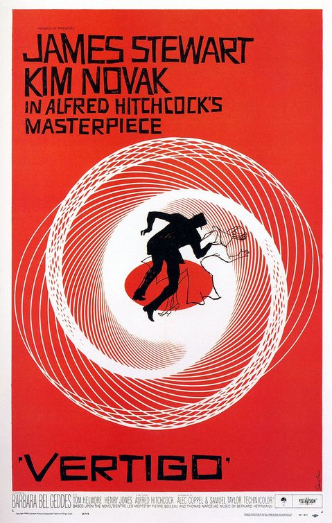
Vertigo's poster has the circular graphic that's repeated on the tile, but I never knew it was suppose to be an eye. At the beginning it was the close-up of a woman's face, and when it focused on her eye, the spinning graphic started emerging from her eye... It was an "Ah Ha" moment for me, "it's a spinning eye."
Anatomy of a Murder looks comical (because of it's ragged paper-cut body parts) and with the sound (almost jazzy music in the background) just enhanced the comedy. I'm not so sure if it's a comedy, but from what I read on the Internet it could be. I liked it especially when at first the arm appeared on the screen and it was sliced in 3 parts, and when the head came out I fear that it was going to be sliced too, and sure enough it did.

Saul Bass created a suspense enough without any sound. His graphic choices are really fitting and the sequences really provides a short intro of the movie and what the audiences can expect from the movie. Thank goodness for Bass!

Another cool title sequence that I really, really, really, really like is Bass' "It's a mad, mad, mad, mad world." Just so fun!


Oh, I forgot to mention this: I really like Bass' fonts on his posters. They're almost always his original hand letterings and it's awesome!

Cult of the Ugly

The Cult of the Ugly was written by Steven Heller in 1993 criticizing the designs today are UGLY. In his words, the examples I'm showing are what he would have, no doubt, called ugly. But who defines ugly and beauty? The audience/viewer, so it's really up to you (anyone and everyone) to say if they're ugly.

The Post Modern examples are really great inspirational pieces. These are a couple of my favorites and the lest favorite one.

This one by Ed Fella and P. Scott Makela is so simple and disturbing yet drives the message so effectively.


This, of course, is by David Carson. I think this is almost his signature layout.
I tried to do his type treatment the other day, but it's just not the same.


This poster, designed by Stephan Sagmeister, is my least favorite of all. I'm just so disgusted by the two tongues that are sticking out. I know they are replacing the arms of 'F' and 'E', but I just hate it. However, if not the tongues, I love the poster—I love the handletterings, the 'F' and 'E' bracketing the title, and I love that it's messy but organized too. He's one of my favorite designers, but I hate his two tongues.


Reading the very, very long interview with Steven Heller, one of Emigre's essays, I realized that Heller seemed to contradict himself many times. Or perhaps his reasonings are not very clearly laid out, like on a map, so everything repeatedly goes forward and backwards. It takes some time to understand some of his reasons, but nonetheless, the interview was good. I'm glad I got to read it.
(He seemed to really dislike the designers from Cranbrook.)


From Katherine McCoy's essay, 'Rethinking Modernism, Revising Functionalism':

"[The Swiss International style] approach was fairly foreign to American clients and in 1968 it was remarkably difficult to convince corporate clients that a grid-ordered page with only two weights of Helvetica was appropriate to their needs. Now, of course, one can hardly persuade them to let give up their hold on "Swiss", so completely has the corporate world embraced rationalist Modernism in graphic design.

So once upon a time American corporations didn't like the Swiss style, how about that. Perhaps they even thought it was too plain, too simple, too ugly... My point is, what seems ugly now might be the normal standard of style/design later. Like McCoy pointed out, and we see it everyday still, it's hard to break from the style today.


Like Heller says, "Ask a toad what is beauty... He will answer that it is a female with two great round eyes coming out of her little head, a large flat mouth, a yellow belly and a brown back." What you see is ugly might seem beautiful to someone else, think of all the culture today and how different they are from each other.

We should embrace the ugly designs, and we should especially learn from them. Just like Segmeister's tongues, someone else might love them. I learned from it, and who knows, someday I just might do something like that.