

Well, it does! The world is changing every second: life and death... but we (I mean human beings) started the technological advancements and its monstrous change is inevitable. It is amazing how fast it is evolving.
I went to the Bruce Mau speech last month and he mentioned the technological changes we're experiencing are the advancements for more than thousands of years... Our technology is advancing double every 12 months, so doubling the double... I can't even imagine how our world would be in 5 years time.
The video "Did you know" shows a very small section of how our world is changing and almost controlled by technology. Amazing how it showed long it took us (humans) to reach 50 million people with radio (38 years), Tv (15 years), Internet (4 years), iPod (3 years), and Facebook (just 2 years). This is the "doubling the double" effect that Mau mentioned. Wow.
The video also mentions that by the time it's 2045, we (humans) would have built a supter computer that exceeds the intelligence of the whole human race! Now that's just depressing. We wouldn't need to exist anymore! Our whole planet would be run by computers, we'd be slaves and servants to the computers... It's like a horrible sci-fi movie.
Though that might be the worst case scenario, I feel that as technology is advancing, we are choosing to live as if back in the good-old-days. More and more people are living minimally, growing their own food, and making things for themselves... But from a design point of view, since technology will be advancing so much that computers (not designers using computers) will be making such extraordinary things that designers are not needed anymore, handmade/handcrafted items will be more valuable and treasured in later years.
Can computer really outsmart us? Maybe, and you could say it already is. But good design is not just the initial pleasing aesthetics, a design is good also when the concept/idea behind it is good. Can computers one day develop concepts and ideas (in other words, think)? I don't know.
Monday, April 27, 2009
Monday, April 20, 2009
Copyright issues - problems & solutions
When I design stuff at work, I always had to rely on the limited photo choices I had, and since they don't want to spend money on stock photos (even if it is only a few bucks apiece) I had struggled to find quality images to work with. I had heard of creative commons before and totally forgot about it! There are so many CC licensed work out there for both commercial and non-commercial use, which is great!
Creative Commons (CC) is a non-profit group created to give free licenses to anyone who wants to share their work, maybe completely free or some restrictions. Unlike copyright items, other people can use and create something new. If it weren't for CC, many creatives would have limited resources.
One of the founders of CC is Larry Lessig. Lessig is a law professor at Stanford who focuses on copyright laws. He gave a speech on the issue at TED. The speech was about finding a balance between copyright and free-use work for the public. Although he didn't (couldn't) mention CC in his speech, it did make me curious to see his solution—CC—and I think it is great.
As of March 21, 2009, more than 100 million flickr images are CC licensed. Pretty amazing. Now, we can have more and higher quality image choices for our work, school or commerical work, without having to worry about the copyright issues like we used to.
Check out their site for more info! And start licensing your work with them.
creativecommons.org
Saturday, April 18, 2009
Finished movie
I finished this movie at 7:30am Friday morning. I tried to submit it to the scholarship show, but the file is too big for the server.... I saved it somewhere else and left a note. I was in such a hurry that I forgot to downsize it for the server. Stupid me... I guess it wasn't accepted. Anyway, here's the full version on you tube.
Please let me know what you think. Are some of the elements too fast? Too repetitive? Too boring?
Please let me know what you think. Are some of the elements too fast? Too repetitive? Too boring?
Thursday, April 16, 2009
Type Animation
It's not quite done, only 2 short sentences left. Let me know what you think.
I'll also post the finished one soon, so when you see it, also leave your comments.
You can be as cruel as you want. I won't mind.
Thanks.
P.S. The video quality is really low!
The finished one will be on YouTube.
I'll also post the finished one soon, so when you see it, also leave your comments.
You can be as cruel as you want. I won't mind.
Thanks.
P.S. The video quality is really low!
The finished one will be on YouTube.
Tuesday, April 14, 2009
Found type
I was googling for images for another project when I came across loads of cool found type.

Here are more typography photographs from this site. Very cool images.
Another one from the same photographer. The photographer's name is Richard Roche. Love the texture!

This "Pianos" photo from this blog site. I love old, peeled off signs.

3 years ago I had to do a similar project for my Graphic Design class. We had to walk around town and capture images of found type and then make a book out of it. I have no idea where the photos are, and the book is all smashed up... My point is that, everywhere has type! Even if it's not man-made, there is still type. Just look up (if you in a crowded city) and you might just find a letter...
Thanks for that post, Rachel. I never knew this could happen.

Here are more typography photographs from this site. Very cool images.
Another one from the same photographer. The photographer's name is Richard Roche. Love the texture!
This "Pianos" photo from this blog site. I love old, peeled off signs.
3 years ago I had to do a similar project for my Graphic Design class. We had to walk around town and capture images of found type and then make a book out of it. I have no idea where the photos are, and the book is all smashed up... My point is that, everywhere has type! Even if it's not man-made, there is still type. Just look up (if you in a crowded city) and you might just find a letter...
Thanks for that post, Rachel. I never knew this could happen.
Monday, April 6, 2009
Design Matters
Design Matters is a radio talk show broadcasted every Friday from 3–4 p.m. ET. It is hosted by Debbie Millman with a guest designer.
Debbie Millman is the managing partner and president of the design division at Sterling Group, one of the leading branding identity firms in the United States.
The talk show I chose to listen to is the one with Stefan Sagmeister in July 2007. In my earlier blogs I had to listen to one of Sagmeister's "happiness" speech and I found it extremely useful. This talk show with Millman is also about how to be happy and perhaps change to be happy.
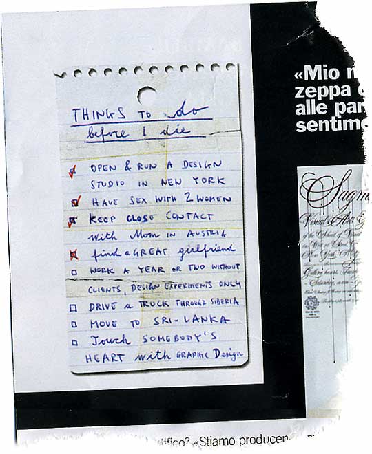
She mentioned one of his AIGA postcards that she just loves very much. It was a list of things Segmeister wants to do before he dies. It's in rough handwritings on a piece of torn (and dirty) notebook paper. It is quiet interesting. Segmeister is so great at using handletterings. Too cool.
Millman's introduction of Sagmeister was his 1999 AIGA poster. I guess he really marked himself (and his assistant) the letterings on his body using an xacto knife... I can't imagine he was happy when he was doing it...

The more I learn about Sagmeister the more I am inspired to do something good (to the public and to myself). If you're happy, your work will show.
I think today design students (myself also) use the computer too much. Everything designed seem to be computer generated and it is aweful. Maybe that's why I like Sagmeister's work so much because he uses real actual things to make type and projects. I stumbled upon one of his posters and I find absolutely in awe and beautiful—posters for Levi jeans. It was given away free if you buy a pair of Levi jeans. What Segmeister did was to actually shread the jeans up into its parts... Again, very cool.


For Segmeister, to be able to come up with ideas when the deadline is still far away with no pressure makes him happy in design. And traveling (and driving a motocycle without a helmet somewhere...) makes Segmeister happy in life.
I think it is important for us, as designers, to be able to be happy with our design and our life.
And to finish off this blog, I'm quoting one of Millman's guide to her personal happines that she mentioned at the beginning of the talkshow:
"People are like plants; they need a lot of water."First, I don't drink enough water, so I have to bear this in mind. But second, and more importantly, is that people like plants need care, nutrients, and the sun; for designers to grow, we need understanding/learn/acceptance of others strength and weaknesses, expand our knowledge, and a creative source... That's what I think and will try to remember.
For other podcasts, here's the link to both the podcast list and the live show link.
(I didn't think they'd have commercial, but... they do.)
Sagmeister’s full list of 20 maxims in his book Things I Have Learned In My Life So Far:
1. Helping other people helps me.
2. Having guts always works out for me.
3. Thinking that life will be better in the future is stupid. I have to live now.
4. Organising a charity group is surprisingly easy.
5. Being not truthful always works against me.
6. Everything I do always comes back to me.
7. Assuming is stifling.
8. Drugs feel great in the beginning and become a drag later on.
9. Over time I get used to everything and start taking for granted.
10. Money does not make me happy.
11. My dreams have no meaning.
12. Keeping a diary supports personal development.
13. Trying to look good limits my life.
14. Material luxuries are best enjoyed in small doses.
15. Worrying solves nothing.
16. Complaining is silly. Either act or forget.
17. Everybody thinks they are right.
18. If I want to explore a new direction professionally, it is helpful to try it out for myself first.
19. Low expectations are a good strategy.
20. Everybody who is honest is interesting.
Tuesday, March 31, 2009
John Maeda

Wow. He is a pretty cool and smart person!
John Maeda is currently the president of the renowned RISD (Rhode Island School of Design), appointed to that position just last year in 2008. Maeda was also the Associate Professor of Media Arts and Science at MIT (Massachusetts Institute of Technology).
As a computer science student at MIT, Maeda was torn between his passions for both computer science and arts. One day, his instructor Muriel Cooper persuaded Maeda to follow his arts & design dream. And good thing she did because Maeda is truly a great designer and his teachings/thoughts really change one person's point of view on design.
He went on and got both his BS and MS degrees from MIT and PhD in Design at Tsukuba University Institute of Art and Design in Japan. He's written books on computer media designs and his most recent book was The Laws of Simplicity.
The Laws of Simplicity outlines 10 rules of simplicity. Some are contradicting the other rules, so what really are the laws? Or is there even one definite rule to simplicity? If Maeda can't even be sure of it, then I doubt I can. However, his 10 rules are pretty good "guidelines" to want to make simple things/designs.
If I have to live by one of his rules, it would be "Simplicity and complexity need each other." This statement really says it all—the whole simplicity business is not really simple and nothing can live without it's opposite. So in a design, it needs to have both simple and complex information.
Perhaps to make a good design it need to achieve a balance in simplicity and complexity, or maybe not, because that might be too harmonious and prove to be too boring...
Then again, one person might see one thing in simple whereas another sees it very complicated.
I don't know what to say now. My thoughts are both simple and yet too complicated to even describe them in words... Anyhow, Maeda is a very important contributor in the 21 c. He didn't get those honorary awards for nothing, you know.
He's pretty funny too, which makes him even more interesting. Here's a speech he gave for a TED conference and I enjoyed it immensely.
Sunday, March 29, 2009
Pretty Cool Type Animation
Title sequence from Jeff Schaffer's 2004 film "Eurotrip." The title sequence is designed by http://www.prologuefilms.com. Video by MovieTitleSequence on YouTube.
Thursday, March 26, 2009
Great Speech Type Animation

I'm doing the "First promotional message recorded on an Edison Phonograph" by Len Spencer.
The speech is important because it was the first promotional message recorded on a phonograph, therefore giving something new, fresh, and interesting for the audience. I can just imagine regular people listening on the radio in 1906 and see their exciting faces! Anyway, it was an important step in history and that's why it's important and interesting.
Len Spencer has a pretty good voice. The speech is a little blurred, not very crisp like our digital recordings today, but hey, it was recorded in 1906 on the Edison phonograph, give it some credit. Spencer's tone throughout the whole speech is dreamy and also exciting. He used a first-person narration—"I" was the Edison phonograph—so it was more interesting. He was promoting something new, and since it was an advertisement, he emphasized a lot on what "I" can do. That's why I think it has a dreamy quality... like having the phonograph can solve all your problems. "I can love...", "I can give...", I can aid..." and I had to giggle when I heard "I give pleasure to all, young and old." I thought, "Wow! I wish I can have a phonograph."
After listening the speech, it made me want to buy a phonograph, so it can solve all my problems... and do all my homeworks...
Short bio on Len Spencer
Born in Washington D.C. on January 12, 1867, Len Spencer became one of the earliest stars of recorded music. He was a rising star on the vaudeville circuit when Thomas Edison created his wax cylinders as a way to capture sound. Originally conceived as a helpful dictation tool, Edison and others soon realized the broader applications to the cylinder, most notably in the realm of entertainment.
Spencer was hired by Edison to help promote his retooled invention, and created the first recorded promotional advertisement in 1888 for the "genuine Edison phonograph." Spencer recorded hundreds of songs on cylinders for Edison and Columbia (the Washington-based recording company that evolved over time into the huge Columbia Records company, now part of the Sony conglomerate), including "Little Liza Loves You" in 1891, one of the best selling cylinders of all time.
He was also one the first white performers to record with an African-American artist, George Johnson. Johnson had an enormous hit wax cylinder in the mid-1890s with his number, "The Laughing Song," which—because of the inability to mass produce wax cylinders—forced him to sing the song several thousand times over. He re-recorded the song with Spencer on metal cylinders and sold thousands more, and began a lifelong friendship with Spencer.
Spencer's early recorded output included best-sellers like the "Lord's Prayer" and speeches by famous public figures, including a posthumous release of President McKinley's speech at Buffalo's Pan-American Exposition in 1901, the day he was assassinated. Spencer was well-known for clear diction and rich baritone, and became a master at comic dialects, recording dozens of songs with vaudeville star Ada Jones, using Italian, Irish, German, Jewish, African American and rural American voices to comedic effect.
In 1902, he recorded the already well-known novelty tune "Arkansas Traveler" onto a 78 rpm disc with banjo great Fred Van Eps and fiddler Charles D'Almaine, and was a national star after it became the first song to sell more than a million copies. The invention of the recorded disc a couple of years earlier by Emile Berliner (also in Washington D.C.) greatly facilitated the mass production of recordings, and Spencer was among the first to benefit. He recorded many sides for the Berliner Gramophone Company in Washington, and for all the other recording companies of the time (Columbia, Victor, etc.) including "A Cowboy Romance" and "A Hot Time in the Old Town Tonight," as well as songs by budding composers George M. Cohan and Irving Berlin.
He moved to New York where he continued to perform and where he founded an artist booking agency, The Lyceum (which employed Spencer's old friend George Johnson as the doorman, working dressed as an admiral). He died in New York in December 1914.
I'm excited to do this project, but I wish we can have more time to do it. It's my first After Effects project (and for most of us in class) so it should be... um... interesting.
Tuesday, March 24, 2009
Stop Stealing Sheep - Chapter Summaries
"Stop Stealing Sheep & find out how type works" by Erik Spikerman and Ginger provides a really good intro and summary for how to use type.
Chapter 1 - Type is everywhere
An intro to type in our everyday lives and explains why type is important to everyone.
Chapter 2 - What is type?
Provides a short history of type and how typography will never stop existing.
Chapter 3 - Looking at type
Provides a good intro to the many different type styles and explains why they work for certain emotions, time period, and events/places...
Chapter 4 - Type with a purpose
Different typefaces have different purposes; for example, script fonts for elegant events like weddings. This chapter also gives the explanation for their functions.
Chapter 5 - Type builds characters
Every typefaces have their own character, mood, style, and personality. It is important to know so we can use them to express the right message.
Chapter 6 - Types of type
Provides an extended summary of the kinds or typefaces are available today and the reasons for the many subtle differences within a type family.
Chapter 7 - How it works
Teaches how to use them correctly for the best results. Many technical aspects of using type is summarized in this chapter.
Chapter 8 - Putting it to work
Reasons and examples of how type should be used in layouts for different applications.
Chapter 9 - There is no bad type
A summary of the book. Type is ever-changing; it evolves to fit the current trends and purposes. What was once a good type is a bad type now, and vice verse. There will also be new typefaces.
Good is... videos
Good is. is a very cool site. The videos are great and funny! And the rest of the site is very graphically interesting. Just too cool (I new some new vocabularies, I keep say this throughout my whole blog site...)
What I especially liked about the site is it always uses unexpected content within a context. I think as graphic designers we need to do this more often, or do it well whenever it's done. It can be hard to think of something out of the ordinary, but that's what sets us apart (the good and bad ones). Also, sense of humor is very important, which Good is. uses a lot.
Visit their site at www.good.is or just click here!
Animated Type
Animated type is type that moves.
However, creating animated type is not as easy as you think. With computer and advanced technology, it's pretty easy to make simple animated type with just a click of the button, but since it's only a click away, anyone can make animated type; which means that you'd have to be extra creative to make some interesting animation. Think of Saul Bass's movie titles; he did them back starting from the 50s till the mid 90s! It's really amazing what he did.
I was in awe when watching the samples on Adobe.com and movie titles on YouTube. I didn't know how they were made before and now, I'm sure I can do it too! (not as good, of course) I also thought for a while that I should do this instead of graphic design... Anyhow, I'm sure I'll learn more about it even after this project is over.
Saul Bass' movie titles are pretty amazing (as I mentioned above). It doesn't really matter if there is sound or not because I got the eerie feeling without the sound. I watched them again with sound and... Ah! Cape Fear is just too freaky! I don't like the movie sequence on Cape Fear (too scary) and I like Vertigo and Anatomy of a Murder's title sequences.
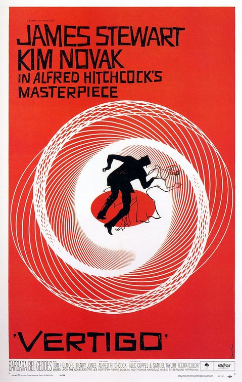
Vertigo's poster has the circular graphic that's repeated on the tile, but I never knew it was suppose to be an eye. At the beginning it was the close-up of a woman's face, and when it focused on her eye, the spinning graphic started emerging from her eye... It was an "Ah Ha" moment for me, "it's a spinning eye."
Anatomy of a Murder looks comical (because of it's ragged paper-cut body parts) and with the sound (almost jazzy music in the background) just enhanced the comedy. I'm not so sure if it's a comedy, but from what I read on the Internet it could be. I liked it especially when at first the arm appeared on the screen and it was sliced in 3 parts, and when the head came out I fear that it was going to be sliced too, and sure enough it did.
Saul Bass created a suspense enough without any sound. His graphic choices are really fitting and the sequences really provides a short intro of the movie and what the audiences can expect from the movie. Thank goodness for Bass!
Another cool title sequence that I really, really, really, really like is Bass' "It's a mad, mad, mad, mad world." Just so fun!
Oh, I forgot to mention this: I really like Bass' fonts on his posters. They're almost always his original hand letterings and it's awesome!
However, creating animated type is not as easy as you think. With computer and advanced technology, it's pretty easy to make simple animated type with just a click of the button, but since it's only a click away, anyone can make animated type; which means that you'd have to be extra creative to make some interesting animation. Think of Saul Bass's movie titles; he did them back starting from the 50s till the mid 90s! It's really amazing what he did.
I was in awe when watching the samples on Adobe.com and movie titles on YouTube. I didn't know how they were made before and now, I'm sure I can do it too! (not as good, of course) I also thought for a while that I should do this instead of graphic design... Anyhow, I'm sure I'll learn more about it even after this project is over.
Saul Bass' movie titles are pretty amazing (as I mentioned above). It doesn't really matter if there is sound or not because I got the eerie feeling without the sound. I watched them again with sound and... Ah! Cape Fear is just too freaky! I don't like the movie sequence on Cape Fear (too scary) and I like Vertigo and Anatomy of a Murder's title sequences.
Vertigo's poster has the circular graphic that's repeated on the tile, but I never knew it was suppose to be an eye. At the beginning it was the close-up of a woman's face, and when it focused on her eye, the spinning graphic started emerging from her eye... It was an "Ah Ha" moment for me, "it's a spinning eye."
Anatomy of a Murder looks comical (because of it's ragged paper-cut body parts) and with the sound (almost jazzy music in the background) just enhanced the comedy. I'm not so sure if it's a comedy, but from what I read on the Internet it could be. I liked it especially when at first the arm appeared on the screen and it was sliced in 3 parts, and when the head came out I fear that it was going to be sliced too, and sure enough it did.
Saul Bass created a suspense enough without any sound. His graphic choices are really fitting and the sequences really provides a short intro of the movie and what the audiences can expect from the movie. Thank goodness for Bass!
Another cool title sequence that I really, really, really, really like is Bass' "It's a mad, mad, mad, mad world." Just so fun!
Oh, I forgot to mention this: I really like Bass' fonts on his posters. They're almost always his original hand letterings and it's awesome!
Cult of the Ugly
The Cult of the Ugly was written by Steven Heller in 1993 criticizing the designs today are UGLY. In his words, the examples I'm showing are what he would have, no doubt, called ugly. But who defines ugly and beauty? The audience/viewer, so it's really up to you (anyone and everyone) to say if they're ugly.
The Post Modern examples are really great inspirational pieces. These are a couple of my favorites and the lest favorite one.
This one by Ed Fella and P. Scott Makela is so simple and disturbing yet drives the message so effectively.

This, of course, is by David Carson. I think this is almost his signature layout.
I tried to do his type treatment the other day, but it's just not the same.

This poster, designed by Stephan Sagmeister, is my least favorite of all. I'm just so disgusted by the two tongues that are sticking out. I know they are replacing the arms of 'F' and 'E', but I just hate it. However, if not the tongues, I love the poster—I love the handletterings, the 'F' and 'E' bracketing the title, and I love that it's messy but organized too. He's one of my favorite designers, but I hate his two tongues.

Reading the very, very long interview with Steven Heller, one of Emigre's essays, I realized that Heller seemed to contradict himself many times. Or perhaps his reasonings are not very clearly laid out, like on a map, so everything repeatedly goes forward and backwards. It takes some time to understand some of his reasons, but nonetheless, the interview was good. I'm glad I got to read it.
(He seemed to really dislike the designers from Cranbrook.)
From Katherine McCoy's essay, 'Rethinking Modernism, Revising Functionalism':
So once upon a time American corporations didn't like the Swiss style, how about that. Perhaps they even thought it was too plain, too simple, too ugly... My point is, what seems ugly now might be the normal standard of style/design later. Like McCoy pointed out, and we see it everyday still, it's hard to break from the style today.
Like Heller says, "Ask a toad what is beauty... He will answer that it is a female with two great round eyes coming out of her little head, a large flat mouth, a yellow belly and a brown back." What you see is ugly might seem beautiful to someone else, think of all the culture today and how different they are from each other.
We should embrace the ugly designs, and we should especially learn from them. Just like Segmeister's tongues, someone else might love them. I learned from it, and who knows, someday I just might do something like that.
The Post Modern examples are really great inspirational pieces. These are a couple of my favorites and the lest favorite one.
This one by Ed Fella and P. Scott Makela is so simple and disturbing yet drives the message so effectively.
This, of course, is by David Carson. I think this is almost his signature layout.
I tried to do his type treatment the other day, but it's just not the same.
This poster, designed by Stephan Sagmeister, is my least favorite of all. I'm just so disgusted by the two tongues that are sticking out. I know they are replacing the arms of 'F' and 'E', but I just hate it. However, if not the tongues, I love the poster—I love the handletterings, the 'F' and 'E' bracketing the title, and I love that it's messy but organized too. He's one of my favorite designers, but I hate his two tongues.
Reading the very, very long interview with Steven Heller, one of Emigre's essays, I realized that Heller seemed to contradict himself many times. Or perhaps his reasonings are not very clearly laid out, like on a map, so everything repeatedly goes forward and backwards. It takes some time to understand some of his reasons, but nonetheless, the interview was good. I'm glad I got to read it.
(He seemed to really dislike the designers from Cranbrook.)
From Katherine McCoy's essay, 'Rethinking Modernism, Revising Functionalism':
"[The Swiss International style] approach was fairly foreign to American clients and in 1968 it was remarkably difficult to convince corporate clients that a grid-ordered page with only two weights of Helvetica was appropriate to their needs. Now, of course, one can hardly persuade them to let give up their hold on "Swiss", so completely has the corporate world embraced rationalist Modernism in graphic design.
So once upon a time American corporations didn't like the Swiss style, how about that. Perhaps they even thought it was too plain, too simple, too ugly... My point is, what seems ugly now might be the normal standard of style/design later. Like McCoy pointed out, and we see it everyday still, it's hard to break from the style today.
Like Heller says, "Ask a toad what is beauty... He will answer that it is a female with two great round eyes coming out of her little head, a large flat mouth, a yellow belly and a brown back." What you see is ugly might seem beautiful to someone else, think of all the culture today and how different they are from each other.
We should embrace the ugly designs, and we should especially learn from them. Just like Segmeister's tongues, someone else might love them. I learned from it, and who knows, someday I just might do something like that.
Tuesday, February 24, 2009
Importance of Writing for Designers
Why is important for designers to write well?
I asked myself many times before when I need to write an essay, “WHY?” and complain “I don’t want to write!” Mind you, I still do, but I also learned to accept the fact that writing is important, even for designers.
There seem to be three ways to communicate: visually, verbally, and literally. For designers, we deal with the visual communication most often, so obviously that’s important. Many of us speak, but speaking well is different from just talking normally. At some point in our careers we will need to give a presentation, so verbal communication needs to be developed well, but that’s another subject. The topic of this blog entry is writing.
Designers can’t always visually communicate successfully with their target audiences, so to ensure they get it, we’ll need to write it out. The writing needs to be clear and understandable and it needs to be thoughtfully written, otherwise we’d lose our audience. There are copywriters for some jobs, but not always, and when we’re dealing with words all the time, it is especially important for us to know how to work with them.
Another major importance we designers need to write well—our resumes and cover letters. It’s hard to be employed (long-term or just freelance) if we can’t even write simple things well.
I find that reading improves writing skills, and the more I read (and write), the better I write, and the better I can write, the better my designs are. Writing is a creative process, so if we (designers) can write logically, we can also design sensibly.
Though I approve of bettering our writing, I absolutely reject the idea of writing when pressured to finish in a short deadline. The creative design writing course mentioned by Andrea Marks in “The Role of Writing in a Design Curriculum” is different because it is a semester-long class where the only objective is to write better; there are deadlines, but it is much easier to learn and improve when the focus is just writing, not writing and designing both at the same time.
Just my opinion. I know it doesn’t change the fact that I still have to do my research paper for my design classes, so the least I can do is whine about it...
There is much to gain and nothing to lose if you can write.
Read lots, write whenever, and design often! It only gets better.
Other reading sources:
“Better Writing Through Design”
Brand New. Very cool site!
Tuesday, February 17, 2009
Design Observer
There are too many articles to read on Design Observer, so, instead of picking through any two, I went with what Rachel recommended.
I really like them all—funny and so creative! I particularly liked Stephen Doyle's work; he really is “ a graphic wordsmith!” (from Stephen Doyle: A Few Words). He is such a genius: WAS masked out on a SAW!; cut out “crafts and arts;” “enemy” with its “new” shadow; his “think!” dice... How does he come up with so many cool ideas for type? Seeing his type art inspires me to do something fun too. As William Drenttel mentioned in that article, Doyle doesn't just Photoshop to make the type; he actually blotted two book together; folded paper to make the word “paper,” and bent a book! I think one of the reasons he's so good is because he doesn't just Photoshop everything. Part of the fun is to actually make stuff, and if it's you’re job, might as well have some fun out of it.


Too cool!
In Jessica Helfand’s “Type Means Never Having To Say Sorry,” a senior graphic design student used the Futura typeface on her Sigmund Freud’s book jackets. Since I’m taking Design History right now, I have some idea of the time period the font and book was created, but if I wasn't taking the history class, I would have no idea and probably answered “I don't know” like the senior. Not that the typeface is inappropriate for the subject, but it is important to know the history/background of something you’re designing, and to have a good reason to why you chose something than just “because I like it and it’s cool.”
I hope when I graduate I’ll have better answers than that senior.
The Futura typeface is overused, like Helvetica, it is now seen everywhere. It is a beautiful and modern sans-serif, and the fact that it was designed in 1928 is just amazing! However, it is so overused, the things created just seem so oridinary and unoriginal—like Barbara Kruger’s graphical style of using Futura.

Barbara Kruger’s style—black & white background image, bold red block, and knocked out Futura—is so simple! I am pretty sure I’ve done this many times without the acknowledgement of the style and the fact that Kruger existed. Michael Bierut’s “Design Under the Influence” mentions the reasons graphic designers today design what they design. And I have to agree completely with him.
“Kruger’s work, after have been so well established for so many years, has simply become part of the atmosphere, inhaled by legions of artists, typographers, and design students everywhere, and exhaled, occasionally, as a piece of work that looks something like something Barbara Kruger would do.”
Can one artist/designer own a style? I don’t think so, and neither does Bierut.
Another article, also by Bierut, “Thirteen Ways of Looking at a Typeface,” is funny and informational. I had no idea a person could be (quoting Bierut) “typographically promiscous.” To use 37 typefaces across 16 pages is a bit too excessive, but if he can make his book work with 79 (yes, seventy-nine) typefaces, each chapter with its own typeface, and not be a bit messy at all, then I guess it’s a great thing. Maybe...
I think it’s still too many. I don’t even think Satan (see below) woule approve it.
Monday, February 9, 2009
Stefan Sagmeister
Only when I was looking through his website did I realize he/his studio designed the "World Changing" book I listed below as one of my favorite book covers. His other work are also creative, original, and truly inspiring.
Watching and reading his design philosophy/ethics made me happy! As he mentioned in his lecture on "Design can make you happy," designing something ordinary but out of context (like the instruction panels in the subway cars) is just genius! He really had the guts to do it.
Using his own inspirational emotional feeling to use in his design is great too. Very original. I should follow him and write up a list of things I learned.
His use of typography is fun! I especially liked it when he showed "for" in cut up sausage-links, but using the shadow to form the words. The bubble speech sticker of the Korean designer is great! Easy way to engage interaction.
A good design helps a good cause; good design with bad cause/meaning is NOT good. In his article on Typotheque, he discusses the meaning of "How good is good?" It's, again inspiring (I'm sorry for overusing this word, but it really is...). After reading his article, it made me want to be a good designer who does good stuff for a good cause. Not just on a persoanl satisfaction, but doing something good for others. If I could be just like 1/10 of him, I'll be happy.
Here's the list of things design can do:
- Design can unify.
- Design can help us remember.
- Design can simplify our lives.
- Design can make someone feel better.
- Design can make the world a safer place.
- Design can help people rally behind a good cause.
- Design can inform and teach.
- Design can raise money.
- Design can make us more tolerant.
I have to disagree with him on one matter—Hong Kong is not a horrible place. Sagmeister made the place sound so bad. It is certainly different from the United States, but if he lives in New York, Hong Kong has the same feel to it too! Growing up in Hong Kong, I get to see the beauty that most tourist don't in one trip. It is a place that takes some time to get used to. And from a design viewpoint, Hong Kong is full of great design. With so much visual interaction, there's bound to be something good.
I miss Hong Kong... Maybe I'll go back this summer.
10 Commandments of Typography
The rules of abiding & breaking the 10 Commandments of Typography
The 10 Commandments
(list is from Paul Felton's book)
1. Thou shalt not apply more than three typefaces in a document.
2. Thou shalt lay headlines large and at the top of a page.
3. Thou shalt employ no other type size than 8pt to 10pt for body copy.
4. Remember that a typeface that is not legible is not truly a typeface.
5. Honor thy kerning, so that white space becomes visually equalized between characters.
6. Thou shalt lay stress discreetly upon elements within text.
7. Thou shalt not use only capitals when setting vast body copy.
8. Thou shalt always align letters and words on a baseline.
9. Thou shalt use flush-left, ragged-right type alignment.
10. Thou shalt not make lines too short or too long.
So, if everyone follows these rules, everyone can be a good page-layout designer. Anyone can do it, so designers won't be needed. Instead, they'd be called lazy and boring people.
If this is true, why the evil-underground-place am I taking this second type class and expecting to take more later...
If there is God, there is always a Demon.
Here are the Type Heresy
(list also from Paul Felton's book... he must have both the angel and demon on his shoulders.)
1. Break the fetters imposed by the use of only three typefaces.
2. Let thine eyes be seduced by the hierarchy of type.
3. Do not forsake smaller or bigger sizes.
4. Be seduced into trying new and expressive typefaces.
5. Treat kerning and tracking with total irreverence.
6. Entice the reader to sample the delights of your text.
7. Do not forgo the liberal use of capitals within your text.
8. The Lord designed letterforms to stand side by side, but there is no harm in their being lured away from one another.
9. Yield to the temptation to align text in unusual ways.
10. Lure the reader down unfamiliar paths.
* Remember, one of the rules of rules is to break the rules—follow the rule.
Tuesday, February 3, 2009
Jakob Trollback
His motion works are just too cool!
Amazing!
I definitely learned a lot from him.
Links to videos and articles:
SVA: Guest Lecture - Jakob Trollback
Trollback - CBS redesign
Trollback + Company
Amazing!
I definitely learned a lot from him.
Links to videos and articles:
SVA: Guest Lecture - Jakob Trollback
Trollback - CBS redesign
Trollback + Company
Tuesday, January 27, 2009
Bruce Mau
Who is Bruce Mau? What has he done and why is he interesting to us?

Bruce Mau is currently the creative director of his company—Bruce Mau Design (BMD). He worked for many different companies and positions, and because of his talents all of the jobs lead to his success now. He also received many awards.
(For a completed list of companies and positions Mau held, please visit the AIGA site.) (I chose not to type them in because it feels too much like plagiarizing...)
Mau is an innovative designer. From his list of "Incomplete Manifesto" I imagine him as a fun person, very easy going, and open to ideas. Definitely "thinking-outside-the-box" kind of person. His ideas are constantly more towards the environmental, or "green," issues. He pays attention to it and brings it to attention. His book "Massive Change" discusses these issues and more. He is one of the "worldchanging" designers. Please visit this interview with Mau on worldchanging.com.
Sunday, January 25, 2009
Mantra
It's hard to choose just one, so I'm also choosing for the next week too!
33. Take field trips.
The bandwidth of the world is greater than that of your TV set, or the Internet, or even a totally immersive, interactive, dynamically rendered, object-oriented, real-time, computer graphic–simulated environment.
I would like to travel. I believe that exploring a fresh new culture, area, atmosphere is important for creative minds.
42. Remember.
Growth is only possible as a product of history. Without memory, innovation is merely novelty. History gives growth a direction. But a memory is never perfect. Every memory is a degraded or composite image of a previous moment or event. That’s what makes us aware of its quality as a past and not a present. It means that every memory is new, a partial construct different from its source, and, as such, a potential for growth itself.
I have come to appreciate history. I learned many, creatively and philosophically, from history, and I would like to learn more.
Monday, January 19, 2009
Book Cover Designs
My Top 10 Book Cover Design List
(as of today and in no particular order)

Final Exits—designed by Greg Kulick
No index page. The book itself is separated alphabetically already; for example: deaths by frozen toilets is under "F." How one person dies by frozen toilets? Read the book.
The layout inside is nothing special, but the cover and the book subject did grab my attention, so I started reading. I never knew there are so many idiotic ways to die.

Eat, Pray, Love—designed by Helen Yentus

A Million Little Pieces—designed by Rodrigo Corral

The Noodle Maker—designed by Charlotte Strick

Extremely Loud and Incredibly Close—designed by Jon Gray

WorldChanging—designed by Stephan Sagmeister
The last 58 pages of the book are dedicated to bibliographies, biographies, acknowledgments, photography credits, and finally, index.
The index has 35 pages! It is organized alphabetically and contains names, topics, and subjects and their page numbers. Some topics or subjects have sub-categories that are indented (also with page numbers).
This book is very thick and the subject matter is wide. The index pages are bound to be thick also. Many designers must have put a lot of time and effort into making this book easy to read, follow, and interesting. However, while I like the Serif font choice for the book (not Times New Roman, thank you), there are too many other fonts. Bolded slab-serif paragraphs are just too much for this editorial-packed book. I find it hard to read most of the time.
I like the grid system they used.

Everything is Illuminated—designed by Jon Gray

Corrections to My Memoirs—designed by Dorothy Carico Smith
While I like A Million Little Pieces cover, I can't help but feel deceived knowing that his book was full of lies. So I guess this book comes into place. I think that it's a clever idea because of the book subject is about untrue stories (lies). It certainly does grab readers' attentions, especially those who read and know the truth of Million Pieces. But I can't help but wonder... Would this be considered plagiarism?

Johnathan Strange & Mr. Norrell—published by Bloomsbury USA
I seriously bought this book because of the book cover. I was looking for a book for my friend; saw the book; it was about magic; he likes fantasy stories; bought the book.
The book later had another version (inverted colors: white background) and different versions (colors and one with background image). I like the black background, hardcover one. The paperbacks are just not impressive at all! They looked ugly.
It's a thick book and he said it was hard to read at the beginning, but overall, not a bad book.
Well, if I have time next time, I'll read reviews before buying the book by its cover. But I'm still glad I bought the hardcover book; the book has more than 800 pages, around 8.5 x 11, a big book. It looks like it's from that period and so real... so comfy.
I have the book still, but where is it now? Oh, they're suppose to be making a movie. Guess I should find the book and read it soon.

Amy Butler's In Stitches—published by Chronicle Books
The index only has 2 pages. It is simple to read and follow: organized alphabetically and following pages. It is clean and simple.
The whole book is well thought out and does reflect Butler's style and her fabric designs.
(as of today and in no particular order)

Final Exits—designed by Greg Kulick
No index page. The book itself is separated alphabetically already; for example: deaths by frozen toilets is under "F." How one person dies by frozen toilets? Read the book.
The layout inside is nothing special, but the cover and the book subject did grab my attention, so I started reading. I never knew there are so many idiotic ways to die.

Eat, Pray, Love—designed by Helen Yentus
A Million Little Pieces—designed by Rodrigo Corral

The Noodle Maker—designed by Charlotte Strick

Extremely Loud and Incredibly Close—designed by Jon Gray

WorldChanging—designed by Stephan Sagmeister
The last 58 pages of the book are dedicated to bibliographies, biographies, acknowledgments, photography credits, and finally, index.
The index has 35 pages! It is organized alphabetically and contains names, topics, and subjects and their page numbers. Some topics or subjects have sub-categories that are indented (also with page numbers).
This book is very thick and the subject matter is wide. The index pages are bound to be thick also. Many designers must have put a lot of time and effort into making this book easy to read, follow, and interesting. However, while I like the Serif font choice for the book (not Times New Roman, thank you), there are too many other fonts. Bolded slab-serif paragraphs are just too much for this editorial-packed book. I find it hard to read most of the time.
I like the grid system they used.

Everything is Illuminated—designed by Jon Gray

Corrections to My Memoirs—designed by Dorothy Carico Smith
While I like A Million Little Pieces cover, I can't help but feel deceived knowing that his book was full of lies. So I guess this book comes into place. I think that it's a clever idea because of the book subject is about untrue stories (lies). It certainly does grab readers' attentions, especially those who read and know the truth of Million Pieces. But I can't help but wonder... Would this be considered plagiarism?

Johnathan Strange & Mr. Norrell—published by Bloomsbury USA
I seriously bought this book because of the book cover. I was looking for a book for my friend; saw the book; it was about magic; he likes fantasy stories; bought the book.
The book later had another version (inverted colors: white background) and different versions (colors and one with background image). I like the black background, hardcover one. The paperbacks are just not impressive at all! They looked ugly.
It's a thick book and he said it was hard to read at the beginning, but overall, not a bad book.
Well, if I have time next time, I'll read reviews before buying the book by its cover. But I'm still glad I bought the hardcover book; the book has more than 800 pages, around 8.5 x 11, a big book. It looks like it's from that period and so real... so comfy.
I have the book still, but where is it now? Oh, they're suppose to be making a movie. Guess I should find the book and read it soon.

Amy Butler's In Stitches—published by Chronicle Books
The index only has 2 pages. It is simple to read and follow: organized alphabetically and following pages. It is clean and simple.
The whole book is well thought out and does reflect Butler's style and her fabric designs.
Definitions
Definitions
Series:
A set of books, maps, periodicals, or other documents published in a common format or under a common title.
Sequence:
A particular order in which related events, movements, or things follow each other: the content of the program should follow a logical sequence.
Sign:
An indication or mark of something, a display of a message, a signal to draw attention

Index:
An alphabetical listing of names, words, phrases (headings), or topics mentioned in the book, with their page numbers. In a traditional back-of-the-book index the headings will include names of people, places and events, and concepts selected by a person as being relevant and of interest to a possible reader of the book. The pointers are typically page numbers, paragraph numbers or section numbers. For serials and journals, the index is usually published after the volume is completed and is usually found in the last issue.

Symbol:
Something such as an object, picture, written word, sound, or particular mark that represents something else by association, resemblance, or convention. For example, a red octagon may stand for "STOP".

Chip Kidd

Chip Kidd
Graphic designer, editor, and writer
He's written two novels about his life in art school, designed numerous great book covers, including his own books, and even sang for his band—Artbreak. What can Kidd not do?
Chip Kidd is an associate art director at Knopf, an imprint of Random House. On an average year, Kidd designs around 75 book covers; designed more than 1,000 book covers; all of them unique, sometimes weird, and definitely interesting. He has won multiple awards for his designs.
Kidd tries to approach his designs in the non-literal way. If the title is "Dry," he makes the cover look wet; " Almost making him sound like a rebel—doing what opposite of what's expected. Maybe it is a good rule for design.
He works with John Gall, who referred Kidd as “The Rock Star of graphic design" and is equally a great designer.

Book cover design is an art itself. A good cover design is defined differently by different designers, but usually the cover shows or even enhances the essence of the book in a unique and surprising way that maybe pushes the design envelope a bit.
Should we judge the book by its cover? It's debatable. But if the content of the book is good, it doesn't hurt to have a good cover design.
Personally, if I see an interesting cover, it grabs my attention and I'll read what the book's about. I'll show some examples above.
I stumbled upon this website and I think it's great.
It shows bookcovers (same books) designed by both Chip Kidd and John Gall. The left side shows bookcovers designed by Chip Kidd (hard covers) and right side by John Gall (paperbacks). I think Gall's work compliments Kidd's work.
http://www.designrelated.com/inspiration/view/Karen/entry/2166
John Gall

John Gall
Vice President and Art Director for Vintage and Anchor Books, an imprint of Knopf (within Random House Inc.)
Gall is the art director for 200 book cover designs each year, all of which are 5-3/16 by 8". He has designed many book cover that truly are unique, interesting, and inspirational, even with the restricted size and format on all his books.
He is probably one of the overlooked book cover designer, especially when working with Chip Kidd, who is considered one of the best designers! But after seeing Gall's work, I can't really say who is better. They're both great.
The book Gall's holding is particularly interesting! After many tries on the design, he finally used the original spine of the book as the cover because that was the only thing he liked. He tried it, and hey, it works!
Another book cover he designed was bizarre. Gall actually used the back cover as the front cover and vice versa. If I saw that book in the store, I think I'd flip it back to the front (in this case, back...)
Watch this video. It shows a video interview of John Gall by Barnes and Noble.
(Also shows 5 other interviews with book designers!)
Gall gives his 5 rules on book cover designs:
1. Read the book.
2. Inspiration is everywhere
3. Be thrifty with fonts
4. Practice sound time management
5. Rules are meant to be broken
Great tips! But according to his last rule, I guess we don't really have to follow rules 1-4...
Subscribe to:
Posts (Atom)